Building a real-time monitoring dashboard for a fleet of gas sensor devices
Challenge
A team operating a fleet of gas-sensor devices needed a web dashboard that showed live CO2, VOC, temperature, and humidity readings from each unit as they happened rather than on a refresh-and-poll cycle, that stayed usable and informative even when a device's connection went quiet instead of freezing on stale numbers, let an operator set their own alert thresholds per sensor rather than hard-coded limits, and gave them a way to see exactly when a device reported an event versus when the server actually received it.
Solution
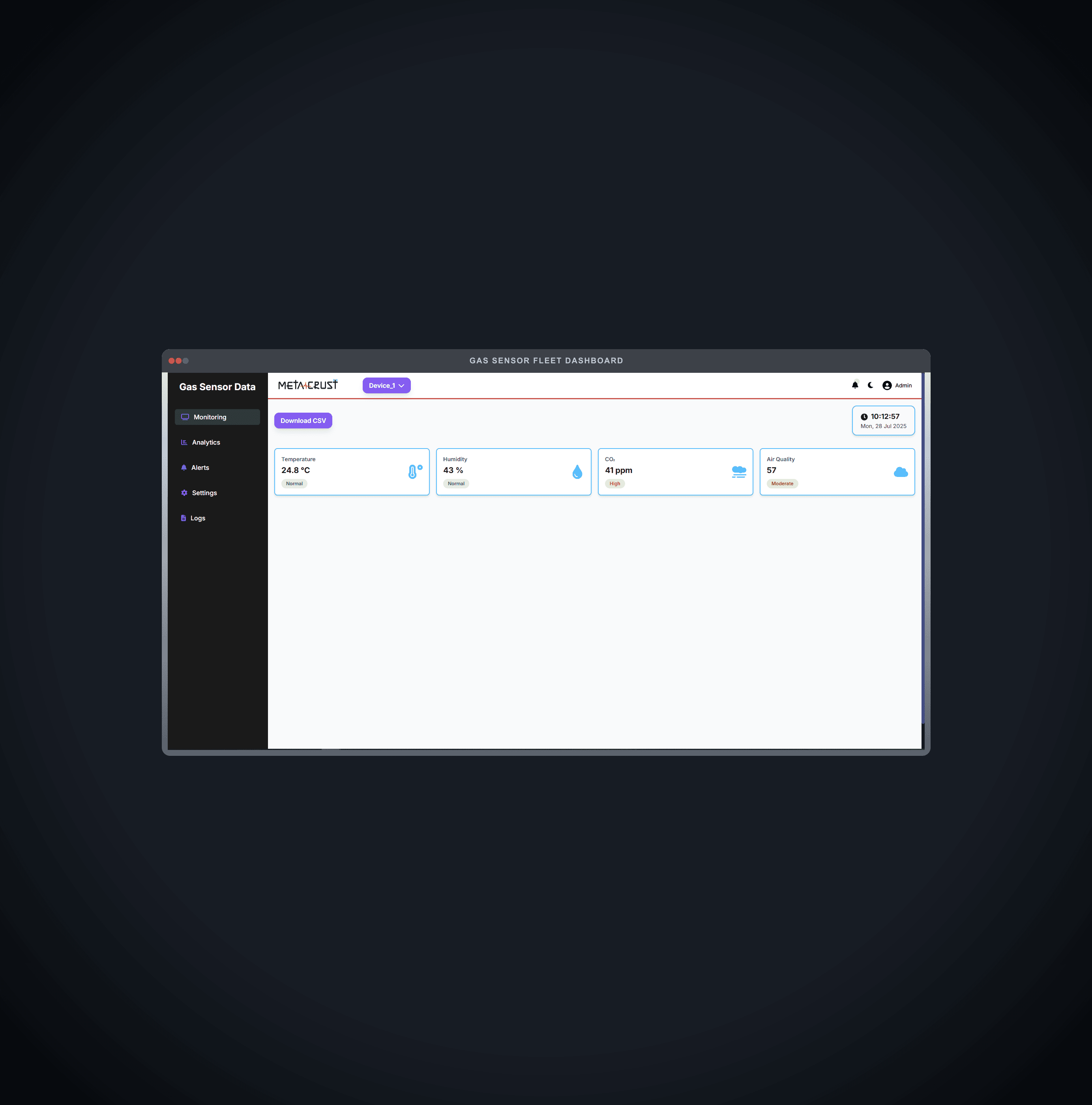
We built the dashboard on a typed WebSocket pub/sub layer - a single connection multiplexing telemetry, historical-analytics samples, server logs, device logs, and CSV-export replies by message type, so each part of the UI subscribes only to the feed it needs. The live monitoring view drives four sensor cards - temperature, humidity, CO2, and VOC/air quality - straight off incoming telemetry messages keyed by device ID, each classified into a graded status (normal/moderate/high/critical) against breakpoints tuned per sensor type. If a device's feed goes quiet for more than 20 seconds, the UI doesn't freeze on stale numbers; it drifts the last known readings smoothly within realistic bounds so the interface stays visibly alive and legible while the connection recovers, rather than looking broken. An alerts view lets an operator set their own min/max limits per sensor, persisted locally, and surfaces a dedicated alert card the moment a live reading crosses outside them. For history, incoming samples are bucketed into 5-minute windows and averaged per metric on the client, building rolling trend charts for temperature, humidity, CO2, and VOC without the server needing to pre-aggregate anything. A dual-stream log view separates server-side events from device-side events, and for every device log shows both the server's received-time and the device's own reported time side by side, so drift or transmission delay between a device's clock and the server's is visible rather than hidden. CSV export is server-driven: the dashboard requests it over the same WebSocket connection and the server streams back a file, keeping the export logic and the live data path on one channel instead of a separate round trip.
Results
The result is a dashboard that behaves like a genuine live monitoring tool rather than a polling page dressed up to look real-time: readings update the moment a device reports them, degrade gracefully instead of freezing when a connection drops out, and let each operator define what "alert" means for their own environment instead of inheriting fixed thresholds. The side-by-side server/device timestamps in the log view give operators a way to actually see network and clock-drift issues instead of guessing at them, and building the trend charts from the same live stream that drives the sensor cards meant one data pipeline serves both the moment-to-moment view and the historical one.
Kick-start your project
Get in touch with our team to discuss your business needs and see how we can help with a project like this one.